Somewhere in the vaulted reading room of a great library, a scholar unrolls a vellum sheet the color of old bone. It creaks at the edges. In the faded ink, continents bloom into strange shapes — Africa too narrow, Asia too vast, the ocean's edge decorated with sea monsters whose coiled bodies suggest what lies beyond is not emptiness but danger. Jerusalem sits precisely at the center of the known world, as if the whole geography of the earth were arranged to confirm what the Church already believed. This document is not merely a map. It is an argument. It is a cosmology pressed flat. And understanding the history of cartography means learning to read such arguments — the ones drawn in ink on skin, the ones that told empires where they ended and where they might yet go.
Maps are among the oldest surviving artifacts of human intelligence, yet they are almost never neutral. Every map is a blueprint of power: it shows who holds the pen, what they consider worth naming, and what they have elected to leave blank. The history of mapmaking is inseparable from the history of conquest, commerce, theology, and empire. To trace the cartographer's line is to follow the ambitions of civilizations.
The Architect of the World: Claudius Ptolemy and the Grid of Cartography
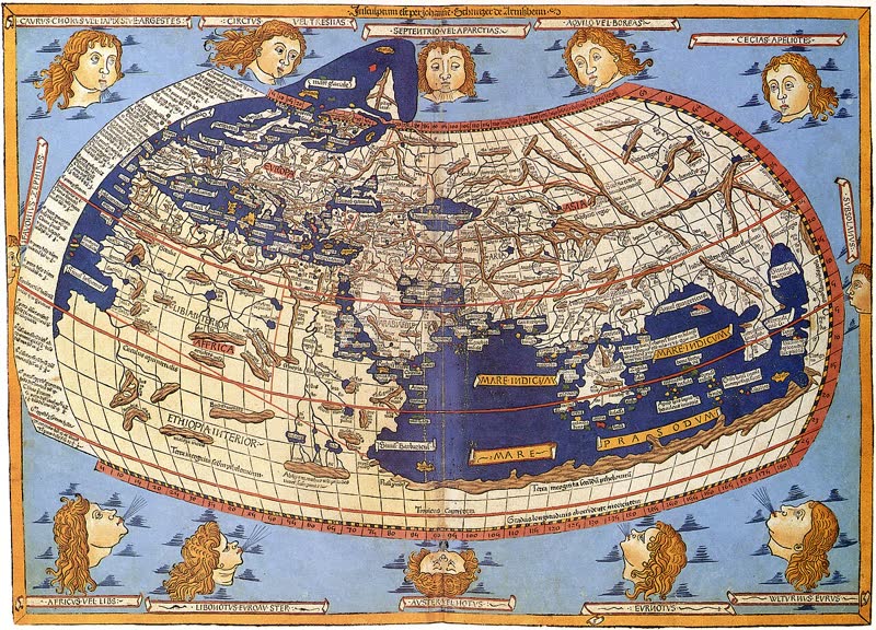
Before there was a science of cartography, there was Claudius Ptolemy. Working in Alexandria in the second century CE, this Greco-Roman mathematician and astronomer produced a work of such audacious ambition that it would define the cartographic imagination for over a millennium. His Geographia — eight volumes of coordinates, projections, and theoretical instruction — was nothing less than a blueprint for rendering the entire inhabited world in two dimensions.
What Ptolemy introduced was revolutionary: a coordinate system of latitude and longitude that allowed any place on earth to be fixed mathematically. He catalogued over eight thousand locations. He described multiple map projections to address the problem of flattening a sphere onto a plane. He standardized the practice of orienting maps with north at the top and east to the right — a convention so deeply embedded in our visual language that it feels like natural law rather than a 2nd-century design decision. In a single work, Ptolemy established the formal vocabulary of cartography: reproducibility, standardization, mathematical precision. He was, in the truest sense, the architect of spatial knowledge.
Yet Ptolemy's Geographia also encoded errors of world-shaping consequence. He dramatically underestimated the circumference of the Earth — by roughly thirty percent. He stretched Asia far to the east, compressing the distance across the ocean between Europe and the Indies. He populated the southern hemisphere with a hypothetical continent he called Terra Australis Incognita — unknown southern land — which cartographers would continue drawing for fifteen centuries before it was either confirmed or disproved. And it was Ptolemy's compressed Atlantic Ocean that helped convince Christopher Columbus, sailing in 1492 with Ptolemaic maps in hand, that Asia was within reach of a westward voyage. The error that launched the Age of Exploration was baked into the most authoritative document in the history of cartography.
"It is the mark of an educated man to look for precision in each class of things just so far as the nature of the subject admits."
— Aristotle, Nicomachean Ethics (a principle that drove the cartographic tradition Ptolemy embodied)
Ptolemy's work largely disappeared from Western Europe during the early medieval period, preserved instead by Arab scholars who translated, extended, and corrected it. When a Latin translation finally reached European humanists in the early fifteenth century, it detonated like a charge beneath the foundations of medieval geography. Within decades, the Ptolemaic coordinate system had been married to the reports of Portuguese and Spanish explorers, producing maps of a world that was suddenly, terrifyingly larger than anyone had imagined.
The Mappa Mundi: When Maps Were Theology
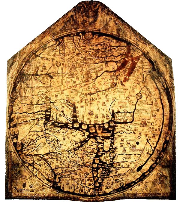
Between Ptolemy's precision and the Age of Exploration lies a medieval interlude that the history of cartography tends to treat as a digression — a period when Western maps abandoned mathematical accuracy in favor of something stranger and, in its own way, more honest. The mappae mundi, the world maps of medieval Christendom, were not failed attempts at geographical accuracy. They were deliberate cosmological statements, and they repay careful study.
The Hereford Mappa Mundi, drawn on a single sheet of calf's vellum around 1300 CE and still housed in Hereford Cathedral, is the largest surviving medieval map in the world — 158 centimeters by 133 centimeters of painted history, theology, mythology, and geography fused into a single astonishing object. It depicts 420 towns, fifteen biblical events, thirty-three animals and plants, and a host of fantastical creatures inhabiting the map's margins: the Blemmyae, a headless race whose faces are located on their chests; the monoceros, the single-horned beast; sea monsters coiled at the world's edge. Jerusalem sits precisely at the center of the circular disc. East — the direction of Eden — is at the top. Christ presides over the whole from its uppermost arc, flanked by angels, watching over the Day of Judgment. The map is not wrong. It is organized around a different set of truths than we now apply.
What makes the mappa mundi so arresting to the modern eye is its frank declaration that geography and theology are one and the same discipline. The shape of the world confirms the shape of salvation history. The layout of continents encodes the story of Noah's three sons — Shem, Ham, and Japheth — who inherited Asia, Africa, and Europe respectively. Distance on the map is not metric but moral: places are near or far from Jerusalem in proportion to their proximity to the sacred, not in kilometers. This is cartography as architecture — a structure built not to navigate the world but to inhabit it, to make it comprehensible, to make its vastness yield to meaning.
America's Birth Certificate: The Waldseemüller Map and the Power of Naming
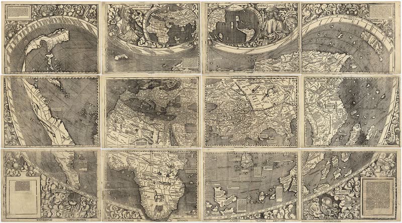
In April 1507, in the small town of Saint-Dié-des-Vosges in the Vosges Mountains of France, a group of humanist scholars produced twelve printed sheets that, when assembled, created the most consequential world map in the history of cartography. Its creator was Martin Waldseemüller, a German cartographer; its collaborator and theorist was the poet and geographer Matthias Ringmann. Together they called it the Universalis Cosmographia — the Universal Cosmography — and it was, in almost every sense, a new world.
For the first time on any map, a fourth continent appeared — a long, tapering landmass to the west, separated from Asia by an ocean that the scholars in Saint-Dié had somehow intuited existed even before Magellan proved it. And across the southern portion of this new landmass, in lettering that would echo down through centuries, Waldseemüller inscribed a single word: AMERICA. The name honored Amerigo Vespucci, the Florentine navigator whose letters describing the New World as a continent distinct from Asia had reached the Saint-Dié circle in translation. Columbus had gone to his grave just the year before, still insisting he had reached the Indies. It was Vespucci's name, not Columbus's, that the world would carry forward.
The Library of Congress purchased the single surviving copy of the Waldseemüller map in 2003 for ten million dollars — making it, at the time, the most expensive map ever sold. It has since been called "America's Birth Certificate," a phrase that captures something essential and something troubling simultaneously. A continent inhabited for tens of thousands of years was named by a German cartographer in a French mountain town, in honor of an Italian navigator, in service of an emerging European imperial project. The power to name is the power to claim. The Waldseemüller map did not discover America. It possessed it.
The map also introduced a subtle but seismic design decision: it placed north at the top and Europe near the center, departing from the medieval tradition of orienting maps toward the east and centering them on Jerusalem. This was not a neutral technical choice. It was a declaration that the European vantage point was the standard against which all other geographies would be measured — a spatial ideology that the next four centuries of cartographic practice would amplify and entrench.
Map Projections and the Politics of Distortion
Every flat map of a spherical world involves an act of violence — a tearing and stretching of curved space that inevitably distorts something: shape, area, distance, or direction. The choice of projection is the choice of what to sacrifice, and those sacrifices are never politically innocent. No episode in the history of cartography illustrates this more vividly than the rise and enduring dominance of the Mercator projection.
Gerardus Mercator, the Flemish cartographer born in 1512, published his great world map in 1569 — Nova et Aucta Orbis Terrae Descriptio ad Usum Navigantium Emendate Accommodata, a navigational chart of breathtaking ingenuity. By representing lines of constant compass bearing as straight lines, Mercator solved an urgent problem for deep-water sailors: how to plot a course that would remain accurate across thousands of miles of curved ocean. The result was the most practically useful navigational tool the age of empire had yet produced. Within a generation, it was in use on every major European fleet.
But the Mercator projection achieved this navigational miracle through a particular distortion: it inflates the size of landmasses the further they are from the equator. Greenland appears roughly the size of Africa on a Mercator map; in reality, Africa is fourteen times larger. Europe is made to appear far larger relative to equatorial continents than geography actually warrants. Not until the late nineteenth and twentieth centuries did the projection become the dominant template for world maps in schools, newspapers, and government offices — by which point its distortions had been absorbed into the popular imagination as fact. Whether this shaped colonial-era attitudes toward the relative importance of different parts of the world, or merely reflected them, is a debate that continues in cartographic and postcolonial scholarship alike.
The proliferation of projections during the Renaissance and after was itself a sign of the era's cartographic ambition. Consider the range of solutions developed across just two centuries:
- Equirectangular projection — Developed by Marinus of Tyre (c. 100 CE) and refined through the medieval period; maps degrees of latitude and longitude as equal distances, creating predictable distortion near the poles but an intuitive grid structure.
- Ptolemy's conic projections — Two variants described in the Geographia, both attempts to preserve the visual relationship between the Mediterranean and the surrounding lands that Ptolemy's data covered most accurately.
- Waldseemüller's cordiform projection — A heart-shaped projection used for some of his smaller maps, derived from Renaissance humanist attempts to represent the globe as an aesthetic whole.
- Mercator's cylindrical projection (1569) — The sailor's standard, preserving bearing angles at the cost of area accuracy; became the de facto world map for navigation and, eventually, for everything else.
- Peters projection (1973) — A deliberate political intervention, this equal-area projection sacrifices shape accuracy to represent landmasses at their true relative sizes, restoring Africa and South America to their enormous actual scale and challenging the visual hierarchy of Mercator's world.
Each projection is an argument. Each one decides which truth to preserve and which to distort. In this sense, the cartographer is always a philosopher — making choices about what matters, whose perspective is centered, and what the world is for.
Secret Charts and the Cartography of Empire
As the great European powers extended their reach across oceans and continents in the sixteenth and seventeenth centuries, maps became instruments of state secrecy so sensitive that their unauthorized copying was punishable by ruinous fines. The Dutch East India Company — the VOC — maintained a dedicated cartographic department in Amsterdam tasked with producing manuscript sea charts for its vessels navigating the spice routes of Asia. These charts were explicitly classified. In 1619, the VOC received a formal monopoly privilege from the States-General of the Netherlands for the production and reproduction of all maps relating to its area of operations. Unauthorized copying carried a fine of six thousand guilders — a fortune sufficient to destroy a merchant's livelihood. The VOC's so-called Secret Atlas, produced in 1753 under hydrographer Johannes van Keulen, was not for public sale; every copy was issued to a VOC ship and physically returned to company headquarters after each voyage.
This was cartography as classified intelligence. The accuracy of a sea chart was a competitive advantage no less decisive than the speed of a ship or the loyalty of a crew. To know the true depth of a harbor in Batavia, the precise bearing of a reef in the Banda Sea, the seasonal behavior of monsoon winds off Ceylon — this knowledge, encoded in ink, was worth fortunes. Empires were built not just by conquest but by the patient accumulation of cartographic advantage, sheet by sheet, voyage by voyage.
The blank spaces on maps — the legendary terra incognita — were equally strategic. They represented not merely ignorance but opportunity: uncharted territory was territory not yet claimed. When Ptolemy had first used the phrase terra incognita to describe the hypothetical southern continent, he was projecting the logic of empire into the void. Every subsequent cartographer who drew a blank and labeled it here be dragons — or more soberly, parts unknown — was issuing an invitation to the next expedition, the next claim, the next act of naming and possession. The map's edges were always the frontier's beginning.
The Map in the Archive
For players navigating The Archivist's puzzles, the vocabulary of cartography runs deep beneath the surface of the word games. Terms like meridian, parallel, projection, coordinate, azimuth, traverse, and bearing all carry their origins in the surveyor's and cartographer's traditions stretching back to Ptolemy and beyond. The word atlas itself — now synonymous with any bound collection of maps — was coined by Gerardus Mercator, who named his 1595 collection after the Titan Atlas, depicted on the frontispiece holding the celestial sphere on his shoulders. Even geography encodes its Greek parentage: geo (earth) plus graphia (writing). To map is to write the world.
The Archivist's aesthetic — dusty libraries, wax seals, blueprints of grand designs, the sense that behind every puzzle there is a deeper structure — mirrors the inner life of cartography itself. A map is a puzzle: it asks you to locate yourself within a system of coordinates, to orient your position relative to fixed points, to read a compressed and coded language and extract from it the information that will get you where you need to go. Every solved puzzle in the Archive is, in a quiet way, an act of navigation. You are plotting your course through a space defined by words rather than by coordinates — but the logic is the same. Find the structure. Follow the lines. Name what you find.
The Lines We Draw
There is a passage from the novelist Michael Ondaatje that has always seemed to me to illuminate something essential about the history of cartography: "Before maps, the world was limitless. It was maps that gave it shape and made it seem like territory, like something that could be possessed." The observation is uncomfortable because it is true. The cartographer does not merely describe the world — the cartographer, in some irrevocable sense, creates it. To draw a line on a map is to assert that the line means something: here is a border, here is a frontier, here is the edge of what we know and the beginning of what we want.
From the clay tablets of ancient Babylon to the clay-colored vellum of Hereford Cathedral; from Ptolemy's coordinate grid to Waldseemüller's audacious christening of a continent; from Mercator's navigational masterpiece to the contested projections of a postcolonial world still arguing about whose perspective deserves to be centered — the history of cartography is the history of human ambition rendered in line and ink. Maps are not mirrors held up to the world. They are blueprints for the world that the people who made them wanted to build.
Some of those worlds were magnificent. Some were terrible. Most were both at once. What they shared was the conviction — the magnificent, dangerous conviction — that the world could be comprehended, organized, and set down on a page. That the chaos of geography, the formlessness of the ocean, the darkness beyond the map's last line, could be brought to heel by a careful hand and a sharp enough mind. That terra incognita need not remain unknown forever.
The blank spaces on the oldest maps were not failures of knowledge. They were invitations. And every generation that took them up — every cartographer who pressed ink to vellum, every explorer who returned with new coastlines, every scholar who bent over a coordinate table calculating latitude by the stars — was answering a question that the map had posed in silence: What lies beyond the edge? The art of cartography, from Ptolemy to the present, is the art of finding out.